uKit
uKit is an online website builder for businesses that you can make with your own hands.
UX / UI design
Design management
GOAL
Design and design the interface of the website builder. Make it modern and user-friendly for users without web design skills.
MY ROLE
As part of the team, I was involved in the conceptualization of the product and its core value - the designer.
As a designer, I designed and designed several key sections and features of the product: site selection in dashboard, wizard, user profile, notifications, site visit statistics, payment and domain attachment.
Description
uKit is a SaaS* website builder for small and medium-sized businesses and non-profit organizations.
SaaS (Software as a service) is when programs are accessed remotely and subscribed to. is when software is accessed remotely and on a subscription basis.
Creating starts with choosing a template, which can save a lot of time.
A uKit user does not need to have web design skills and can build a website using ready-made templates, widgets and blocks.
After selecting a template user can add edit or remove unnecessary widgets. In the designer he can also create pages and view the result.
After publishing the site, the user can customize statistics, attach his domain, check the readiness for promotion and other actions necessary to make the site work effectively.
Selecting a site
GOAL
Design an interface to select the active site for the user. It was necessary to take into account the situations when the user has few and when there are many sites.
SOLUTION
I positioned the open window button in the header so that the site selection would be available in any section of the dashboard.
The selection should clearly show the cards of sites. To make it easy for the user to navigate, in addition to the name, the card should contain a screenshot of the home page and the URL of the site.
Additionally, on the card, I arranged frequently used actions.
I've formalized the various states of the site card:
- selected,
- paid,
- trial expired,
- unpublished,
- blocked,
and other rare cases.
Based on user expectations, I added filtering and sorting.
For the situation when a user has a lot of sites, I added display in the form of a list.
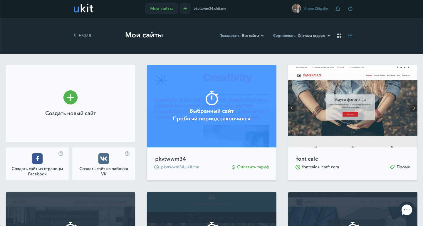
The selected site is highlighted and shows its status
Photo by Ralph (Ravi) Kayden
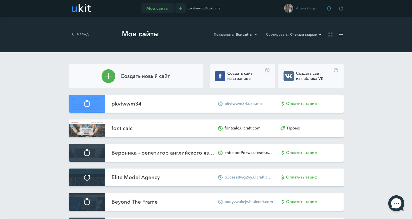
If a user has many sites, they can enable list mode for easy browsing
Photo by Ralph (Ravi) Kayden
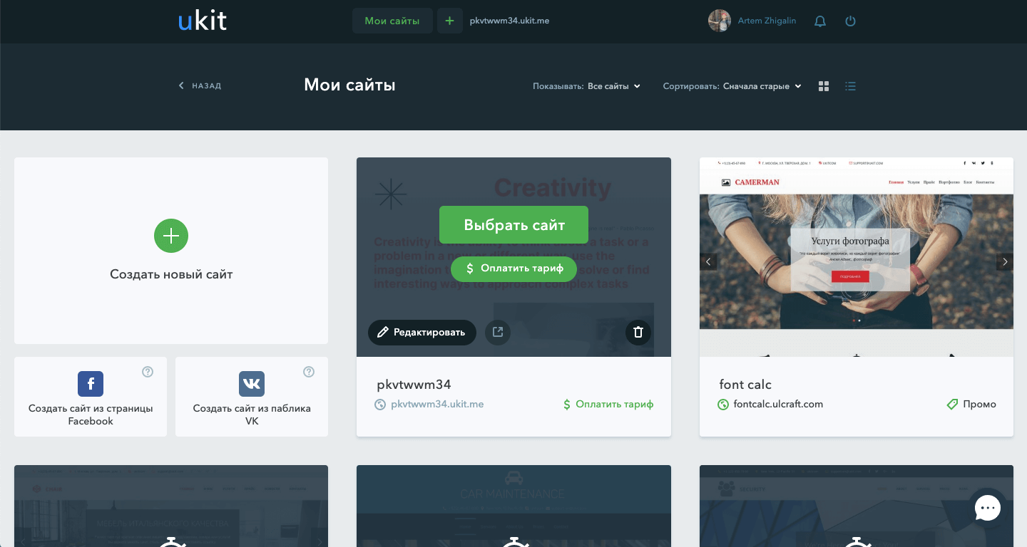
When you hover over a card, relevant site actions are displayed
Photo by Ralph (Ravi) Kayden
Statistics page
GOAL
Users just need to connect and visually see the statistics of site visits.
Statistics should take and show data from Yandex.Metric and Google Analytics.
Solution
I have highlighted the information that is most interesting to users. Then I have formalized this information in the form of visual graphs, diagrams, tables and factoids.
I also designed a step-by-step wizard for connecting stats with supporting instructions.
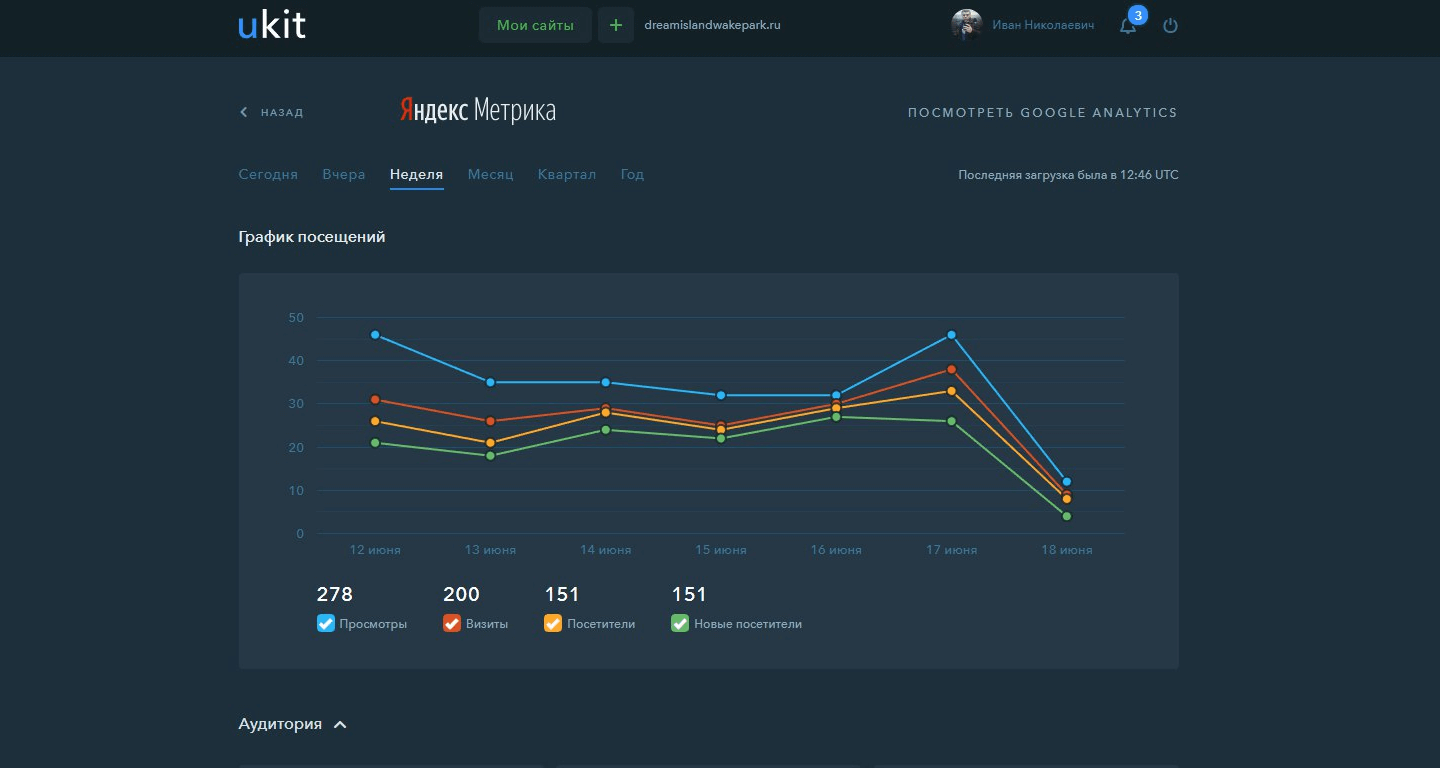
The main thing that the site owner wants to see is a clear dynamics of visits
Photo by Ralph (Ravi) Kayden
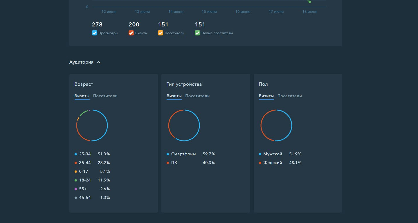
Audience characteristics are shown in the form of pie charts
Photo by Ralph (Ravi) Kayden
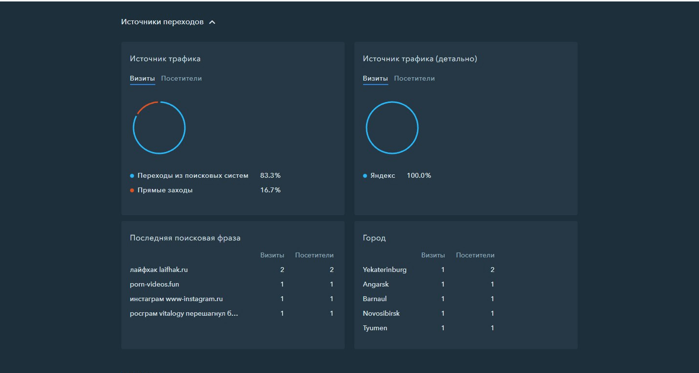
The next most important thing is where the visitors came from, what search phrase, what city they came from
Photo by Ralph (Ravi) Kayden
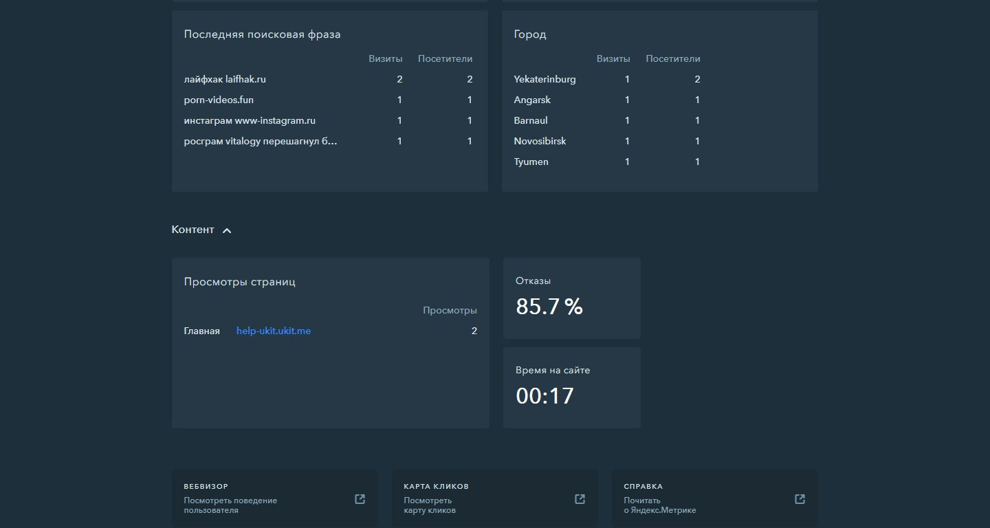
Last in importance are the content characteristics and the ability to go to detailed views
Photo by Ralph (Ravi) Kayden
Purchase and connection of domains
GOAL
Design an interface for purchasing and attaching a domain name to a website.
The solution should be in the form of a step-by-step wizardry understandable to a novice.
Solution
The start screen shows two options for action: buy or attach a domain.
In case of purchase, the user enters the desired domain name and then the search process with the output of the results takes place. In this list users can see which domains are free and which are not, as well as the price for which they can buy the corresponding domain.
On the attachment page, the user attaches the domain to their site in three steps.
I have also described instructions on how to change NS records for each of the popular registrars.
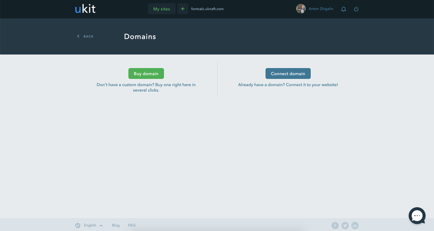
Choice between buying and linking a domain
Photo by Ralph (Ravi) Kayden
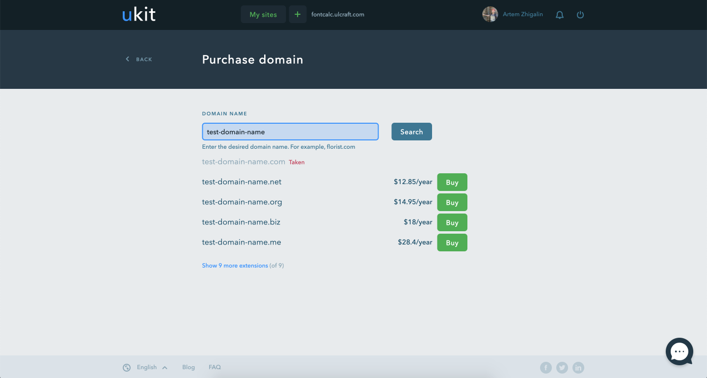
Search for the right domain. The results show the most popular zones first
Photo by Ralph (Ravi) Kayden
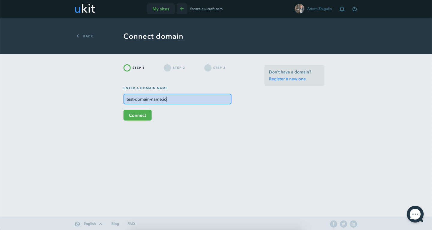
The process of linking a domain to a website
Photo by Ralph (Ravi) Kayden
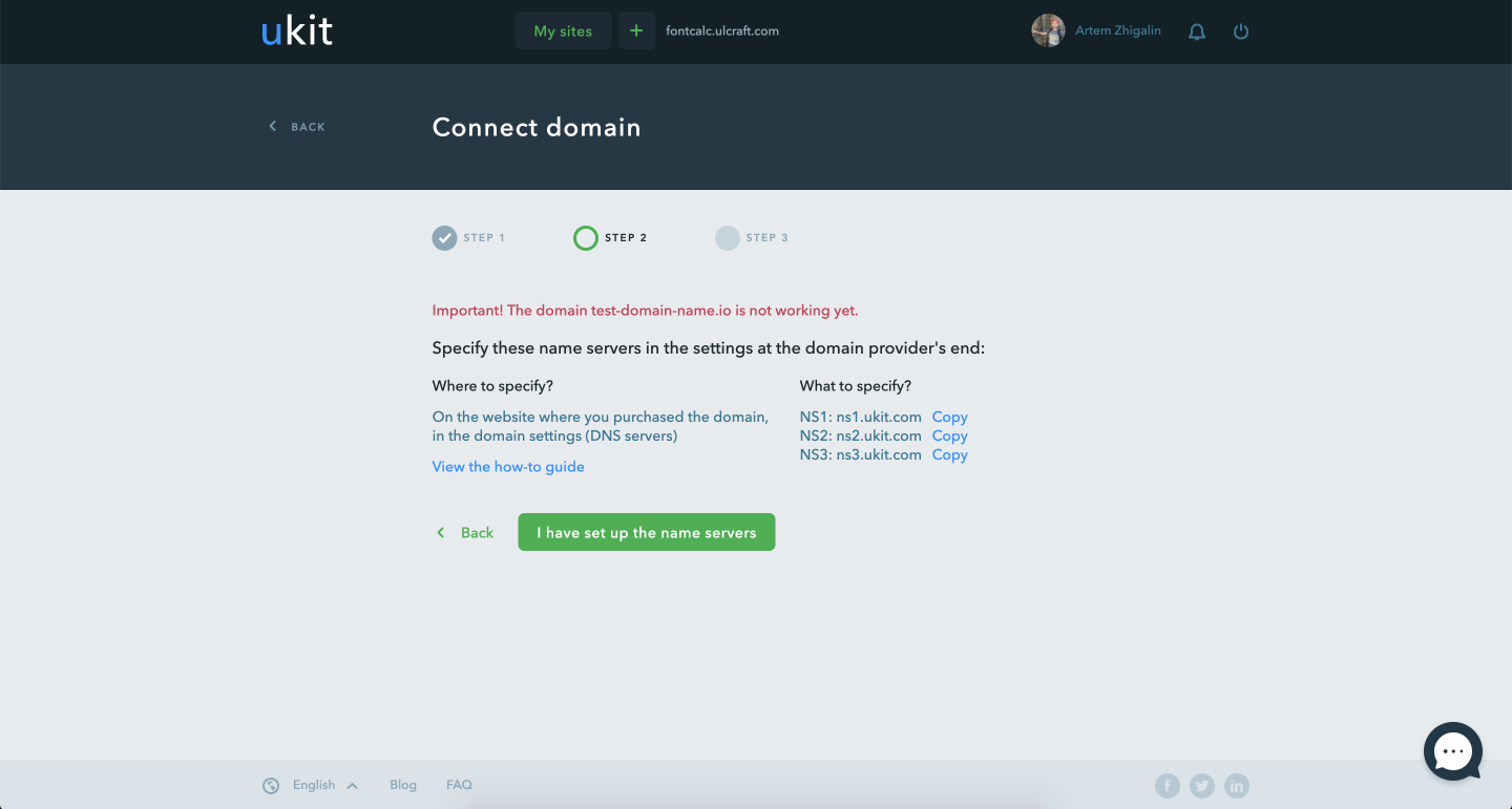
The second step of binding, specifying NS
Photo by Ralph (Ravi) Kayden
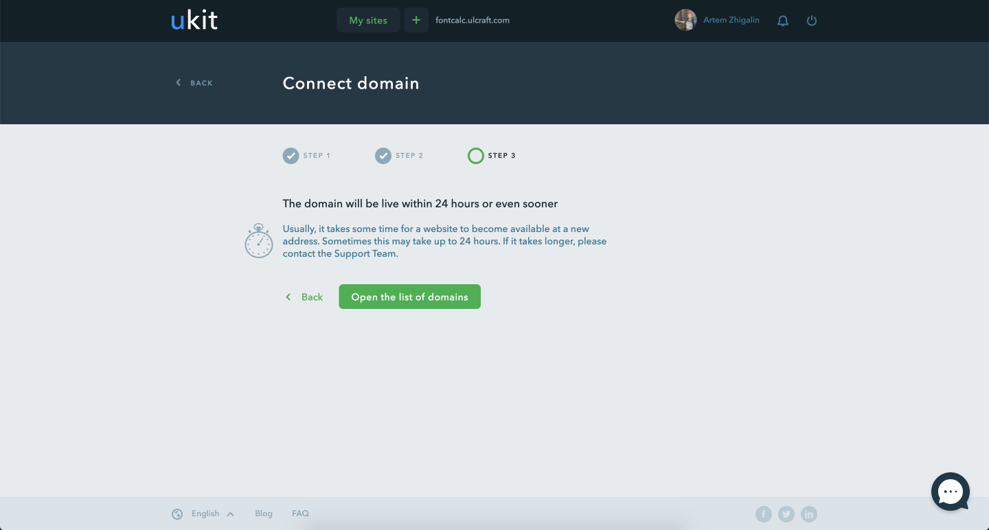
Final step
Photo by Ralph (Ravi) Kayden
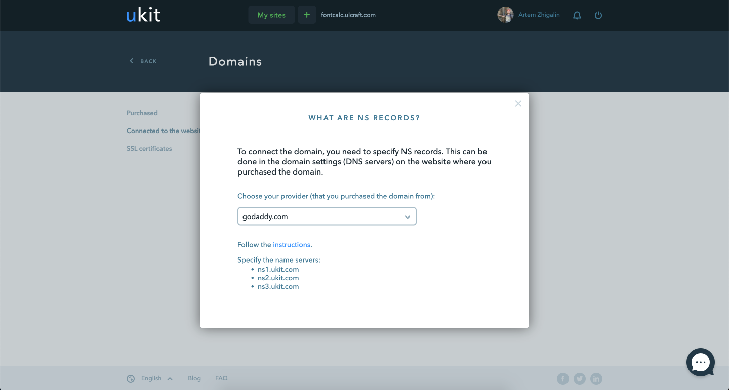
Instructions on how to specify NS in different domain registrars
Photo by Ralph (Ravi) Kayden
Payment and payment management
GOAL
Design the payment interface, payment management page and payment history
Solution
On the payment screen I have placed the choice of period and payment method. Most often payment is made with a bank card, so I set it as default and made the form for entering data as similar to a bank card as possible.
On the payment management page I have listed all active and inactive subscriptions.
I have organized the history of payments in the form of a table where all the facts of payment are located.
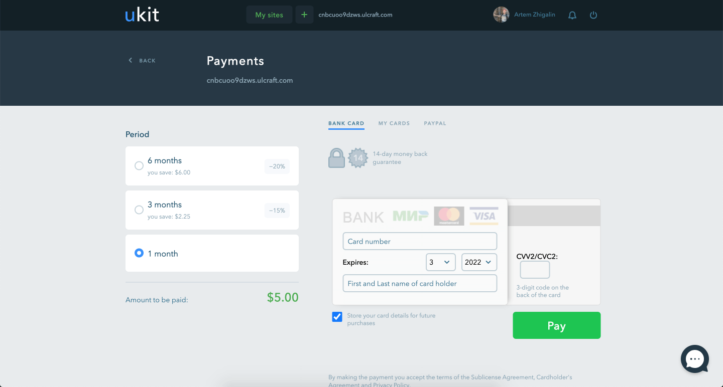
It's important to show period selection and payment form on the same screen to reduce the number of steps and increase conversions
Photo by Ralph (Ravi) Kayden
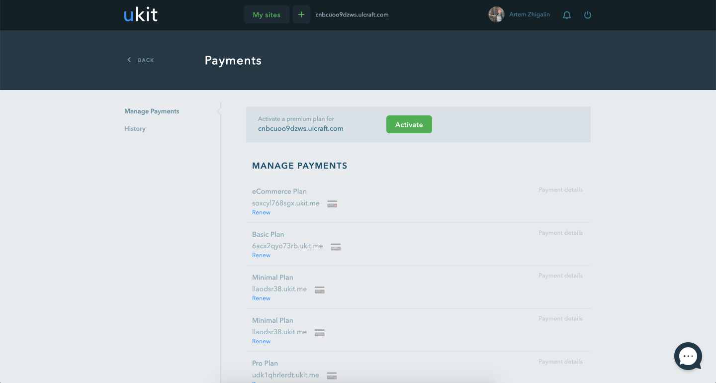
Subscription Management Screen
Photo by Ralph (Ravi) Kayden
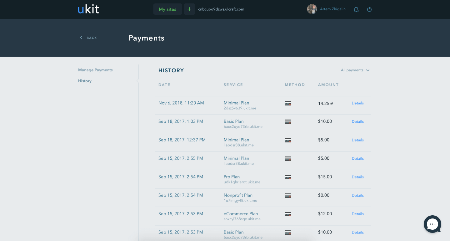
History of invoices
Photo by Ralph (Ravi) Kayden
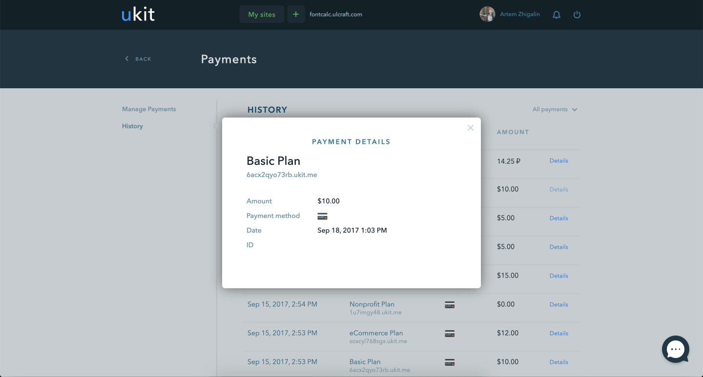
Invoice details
Photo by Ralph (Ravi) Kayden
Notification system
GOAL
Need a way to notify users about bugs, end of trial or paid period, promotions, news and other events.
Need a form to send personal and general notifications.
Solution
On the payment screen I have placed the choice of period and payment method. Most often payment is made with a bank card, so I set it as default and made the form for entering data as similar to a bank card as possible.
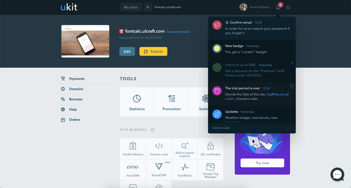
The button to bring up the notification list is in the dashboard header
Photo by Ralph (Ravi) Kayden
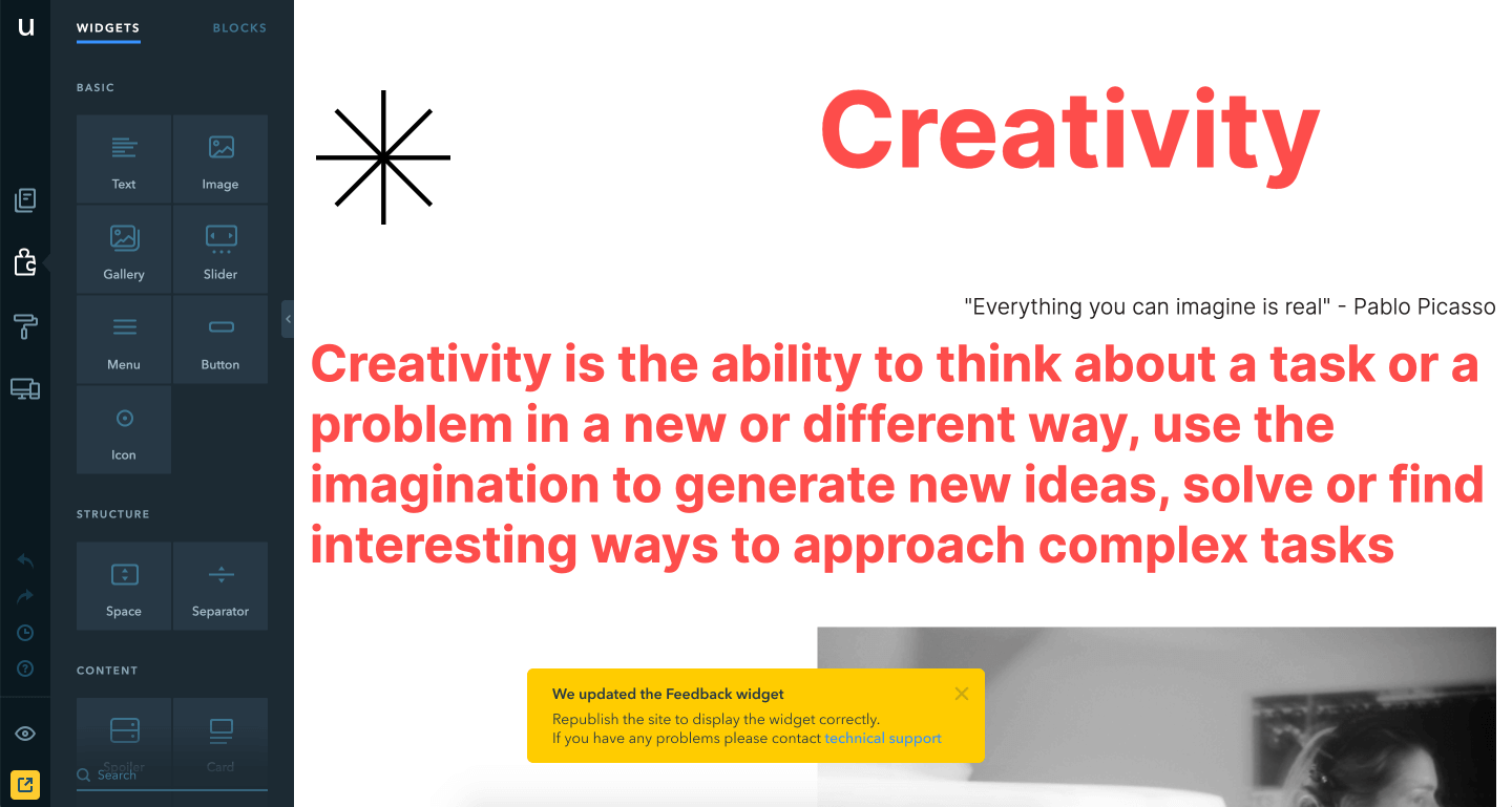
A type of toast with important information for the user
Photo by Ralph (Ravi) Kayden
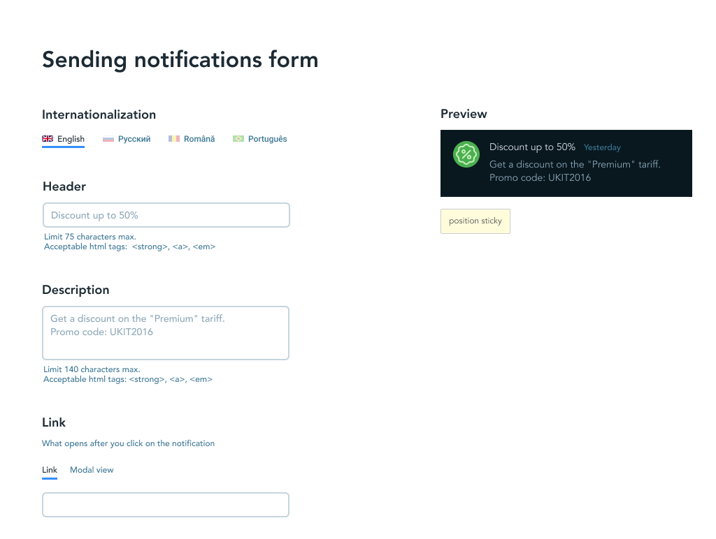
The form for sending notifications to users contains a preview
Photo by Ralph (Ravi) Kayden
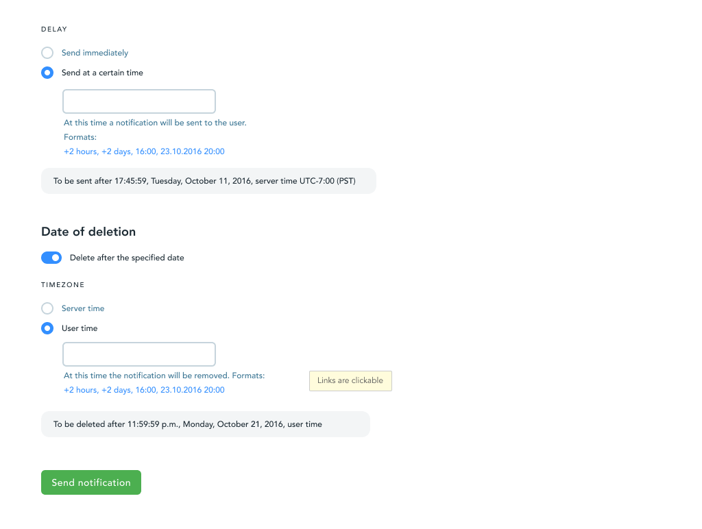
You can fine tune the send and delete date before sending it out
Photo by Ralph (Ravi) Kayden
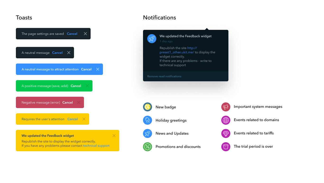
Notification and toast options
Photo by Ralph (Ravi) Kayden
Results
I was involved in designing key sections of the product: site selection, wizard, user profile, notifications, statistics, payment and domain linking.
I made the platform user-friendly and accessible for users with no web design experience, which helped uKit strengthen its position among the best solutions for businesses.
© Artem Zhigalin | psycholcycle@gmail.com
